
Brief
Take a locally made product in my case, “Mague” then rebrand and package it.
Concept
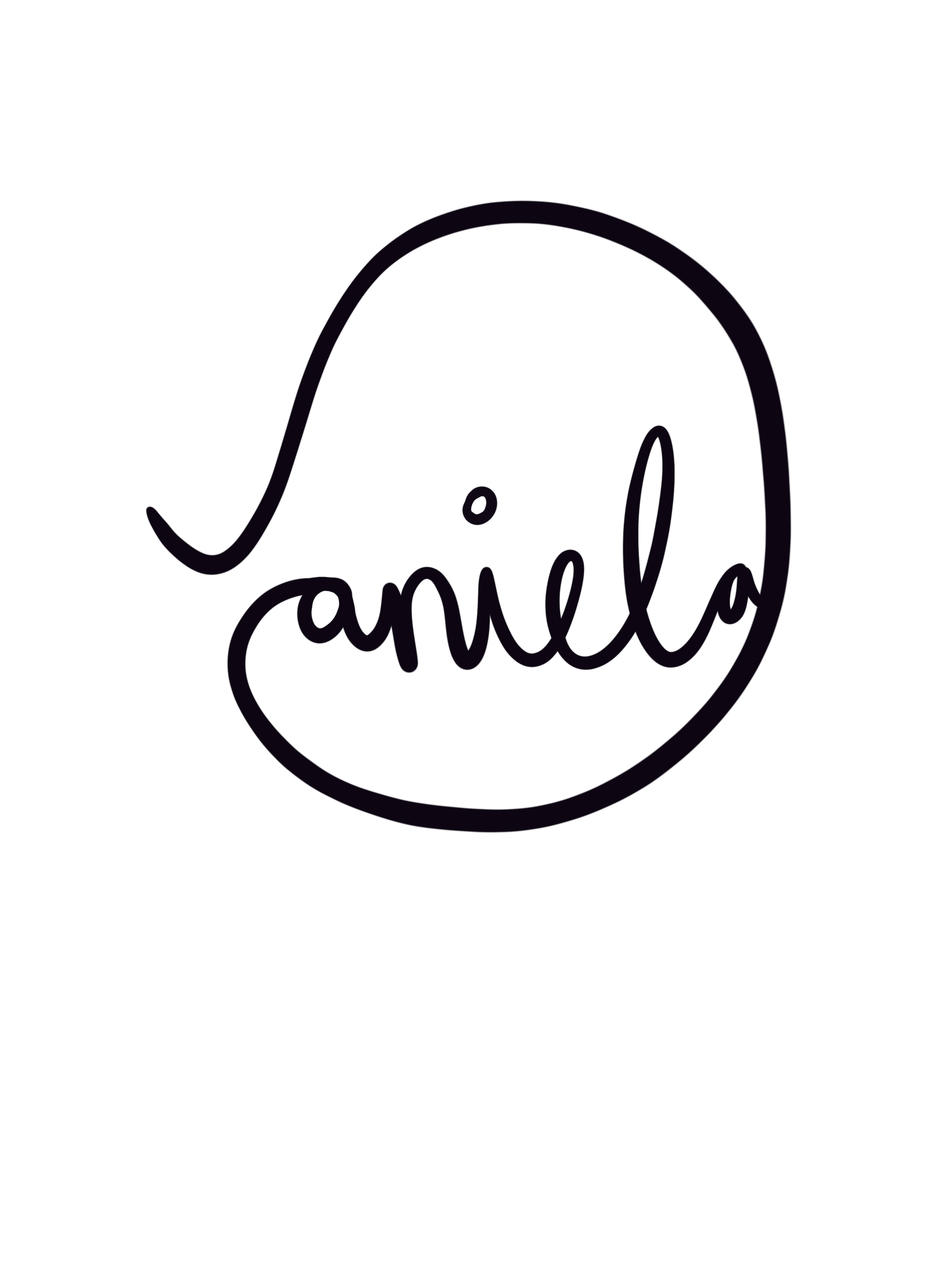
The key factor that I based my brand on was the fact that Mague will now contain Moringa. Moring has many health benefits, it’s lowers blood sugar levels, acts as an antioxidant, natural inflammatory etc…so I created a simple design that is based on outlines. I did this so that the packaging doesn’t look cluttered. All current Mague beverages in South Africa have very cluttered and overpowering packaging, this doesn’t allow the beauty of the product to be celebrated.
My outlined logo and illustrations, feeds into the fact that I want to keep it minimal and elegant. The thin floral designs and imperfect circle all ties it in with a rustic and organic aura.
The name of the product “GoGet” is very catchy and implies an immediate action – pulling potential clients in, so #GOGETYOURHEALTHFIX #GOGETYOURGREEN
I based my promotional poster on the fact that you must “shake well before use” ,
I instantly thought of that song “Shake it , shake it like a polaroid picture...” , so my poster shows movement and fun, whilst still being green and organic. The slogan “shake it like a polaroid picture” has longevity, as it could be promoted all over social media in a polaroid and tell consumers to take a picture of their GO GET drink and post it online to win a polaroid camera. The strength in my brand is that it can be applied over many different digital platforms.
#GOGET #SHAKEITLIKEAPOLAROIDPICTURE #WINAPOLARIODCAMERA #SUSCRIBE NOW

Chosen Logo

Branding - Ginger flavour

Branding - Lemon & Lime flavour

Branding - Mint flavour

Packaging - Vinyl Stickers (flat design)

Packaging - Bottle design

Lid stickers

Lid stickers for all flavours (flat design)

Promotional Material - Poster

Promotional Material - Poster

Promotional Material - Informative poster